
The Romo Effect and the Coming Evolution of Volleyball Storytelling - part 2
Creating Building Blocks That Change How We Watch the Game

This is an adaptation of the presentation I gave for VolleyStation at the 2025 AVCA Convention. Slides and presentation video can be found at the bottom of this post. All data is taken from NCAA tournament semifinals and finals, 2015-2025 and the 2025 NCAA tournament regional semifinals and finals.
In part 1 of the series, I outlined some of the problems with the tools currently available for storytelling and how volleyball actually works so I can dig into how we can build off of that structure to tell better stories.

In part 2, I’ll outline some of the building blocks that we should be using to better connect how we talk about the game to how the game is actually contested.
The Building Blocks Volleyball Needs
Kill percentage
Distribution data
Reception data
Points
Team scoring data
Set-level data
Kill Percentage
Kill percentage is similar to attack efficiency but it explains more with less. It's better at describing how often a player or team scores when attacking, it's better for predicting outcomes and layering into more advanced stats. How is kill percentage similar to attack efficiency? Kills do most of the work in determining what a team's or player's attack efficiency is.
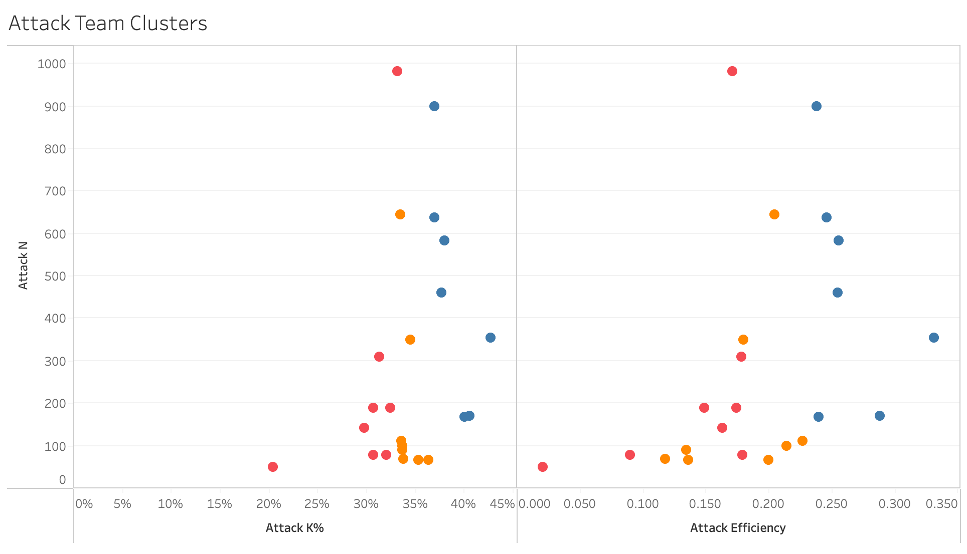
The data in the plots above show team kill percentage and attack efficiency, with teams clustered into thirds. You can see that the distribution of the teams is roughly the same in both plots. That means changing from attack efficiency to kill percentage doesn’t take any explaining. The benefit is that kill percentage has a much clearer connection to winning points, winning sets, and winning matches. When a team has a higher kill percentage than their opponents, they almost always win. Kill percentage helps fans understand what is likely to happen when a team attacks. Teams that earn kills 50% of the time will score about half the time they attack. It’s much harder to figure out how often a team that hits .250 scores, but it isn’t 25% of the time.
As that example shows, kill percentage is more intuitive than attack efficiency. It’s more intuitive because it doesn’t include errors. Remember that winning the race means getting to 25 the fastest, not the cleanest. Kill percentage helps fans understand who’s winning and why more easily than attack efficiency.
Distribution
Distribution data is much better than assist data because it tells more about setters and offenses, it connects better to attacking and passing metrics, and it creates opportunities to discuss decision making and strategy. The stories that can be told about setters using distribution are stories about how they manage their teams' offenses and distribution gives fans insight into how setters are doing that job.
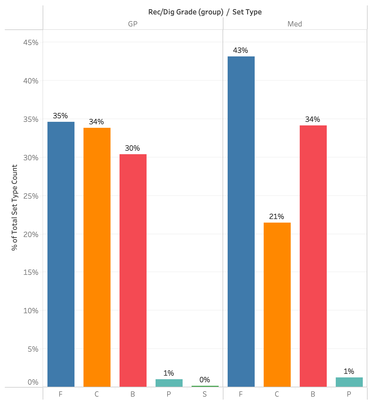
The data in the two plots above show how NCAA semifinalist and finalist setters distribute the ball to their attackers in two situations, good passes and medium passes when they have three front row attackers. It’s not necessary to understand reception grades or passing averages to understand what these plots are saying though. All a fan needs to understand is that “good” means the setter’s life is easy, they can set comfortably and “medium” means the setter’s job is a little bit tougher, they have to move a decent amount before setting.
In the semifinals and finals, setters distribute the ball fairly evenly between outside hitters (F), middles (C), and opposites (B) when things are easy. When things get a little harder, they set middles a lot less, set outsides a lot more, and set opposites a little more. That makes a lot of intuitive sense as fans watch games. That becomes a baseline and comparisons can be made between that baseline and specific teams.
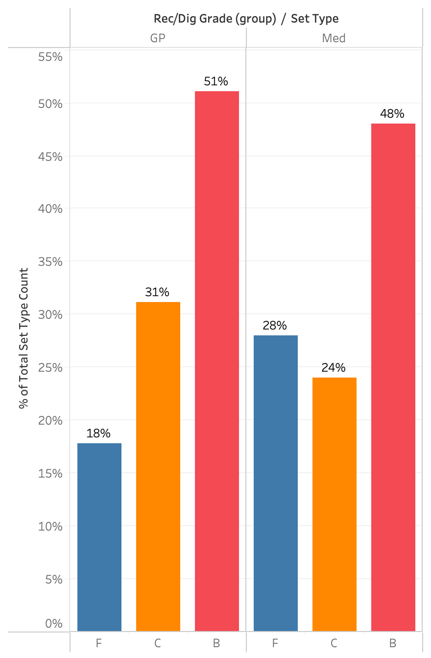
As an example, here are the same two plots, showing only 2025 NCAA champions Texas A&M’s distribution. They benefitted from having All American Logan Lednicky attacking on the right, so they set her much more than most teams would set their opposites. As a result, they set their outsides much less and their middles an average amount. When things got harder, they didn’t set Lednicky much less. (You may remember how well Maddie Waak, their setter, was able to take some more challenging passes and get them to her top attacker.) Waak set Lednicky much more than most semifinalists and finalists set their opposites on medium passes.
Having this information available for discussion gives broadcasters and fans rich and interesting ways to talk about setters and offenses that current data doesn’t allow. When people want to talk about how a team’s offense runs through a certain player, distribution data is a powerful way to tell that story.
Reception Data
Contrary to expectation, the kind of reception data needed for better storytelling isn’t reception averages, at least not in the near future. Gathering that kind of data would be much more difficult because it would require many more people with specialized knowledge of the game and it would require universally accepted standards for receptions. Both of these things are highly unlikely to happen any time soon, but that doesn’t mean there aren’t stories to be told about passing.
Just having information about how often each player passes would be a great start. That information would facilitate stories around serving strategies as well as more nuanced discussions of the “serve-pass battle” that often comes up. Who teams are serving is an important part of that battle, but there’s no data available to support those discussions.
To give an example of how that simple data can be layered onto other data to tell better stories, consider one aspect of how Louisville and Texas A&M served at each other in their regional semifinal.
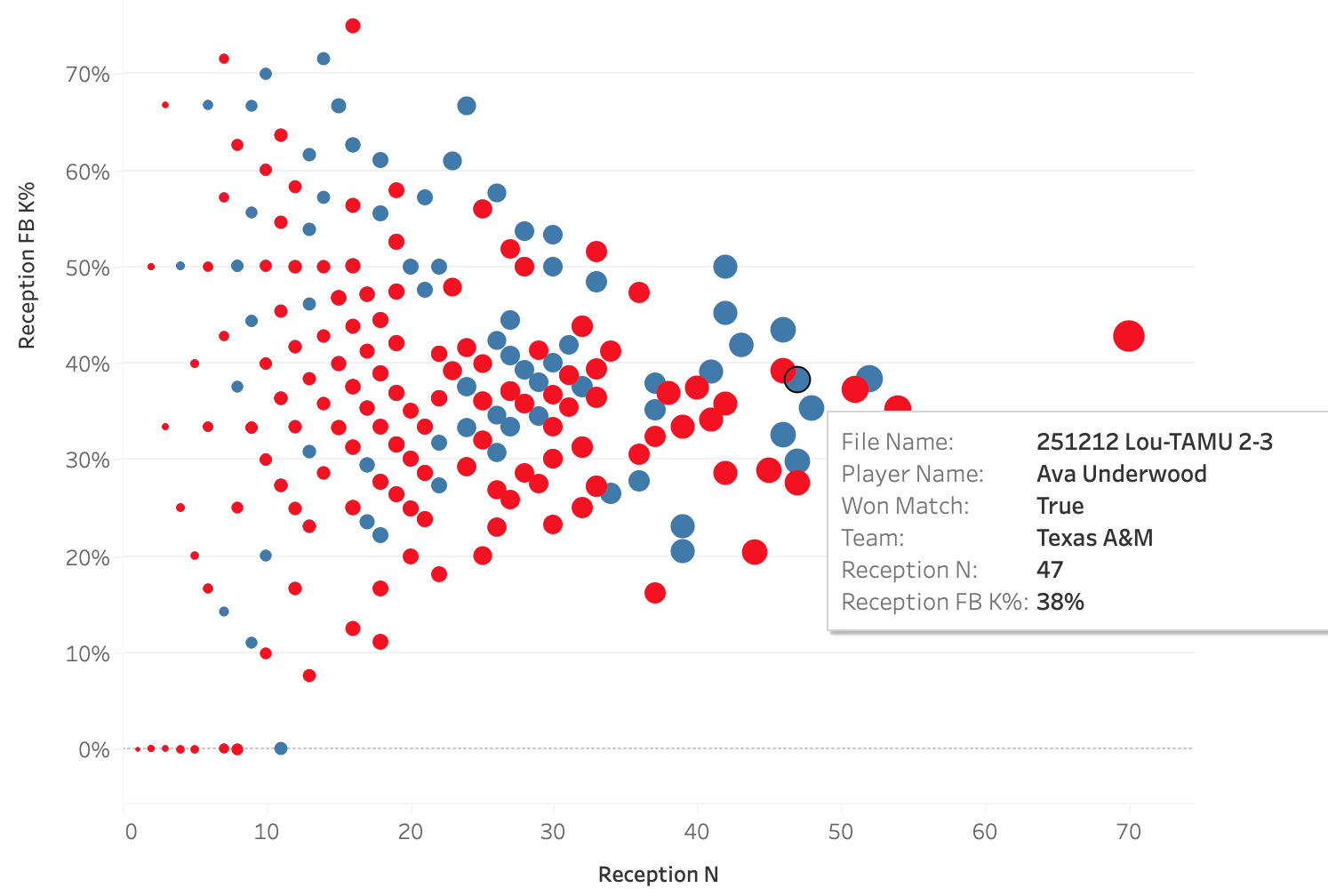
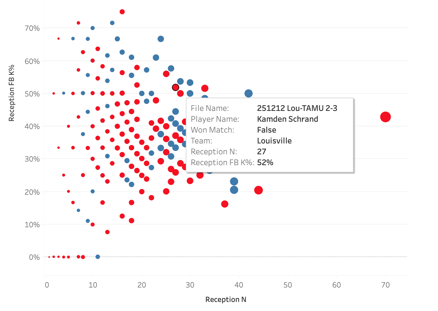
These two plots show the same data, the only difference is which data point is highlighted. The plots show how well a team attacked in a match when a particular player passed compared to how often that player passed, so each dot is a single player in a single match. The two highlighted players are liberos, Ava Underwood of Texas A&M and Kamden Schrand of Louisville, and the boxes show their performances in their match against each other. Louisville served at Underwood 47 times in the match and Texas A&M earned a first ball kill 38% of the time when she passed. Contrast that with how A&M served at Schrand: she passed only 27 serves, probably because her team earned a first ball kill on 52% of her passes.
There’s a story to be told there about why each team chose their serving targets but that story can only be told if people have access to reception counts. The story gains depth from the addition of kill percentage. Using this data, it becomes possible to not only talk about serving strategies but it also becomes possible to have stories to tell about liberos and other ball control players.
In part 3, I’ll finish digging into the building blocks and close with a look forward at where we could go.
The Romo Effect and the Coming Evolution of Volleyball Storytelling - part 3

This is an adaptation of the presentation I gave for VolleyStation at the 2025 AVCA Convention. Slides and presentation video can be found at the bottom of this post. All data is taken from NCAA tournament semifinals and finals, 2015-2025 and the 2025 NCAA tournament regional semifinals and finals.
To view the video of the presentation as well as the slides, click this link:
