
You Can’t Say “Numbers" Without Saying “Numb"
Comparison fluency and quantification fixation

The more time I spent as an analyst, the more I would explore different data visualizations in efforts to give coaches more ways to understand data and make comparisons. But what I noticed is that they would almost always end up looking at tables of numbers, no matter what else I presented them with. I recently read an academic paper1 that put that tendency in a new light.
The paper asks the question, “does counting change what counts?” The researchers were questioning if people reach different decisions if information is quantified or not. They asked people to make decisions after comparing things on two different dimensions. One of those dimensions was assigned a number and the other dimension was assigned a qualitative description. The researchers found that people, throughout a variety of settings and information, would tend to base their choice on the dimension represented numerically much more frequently. The scientists referred to this finding as the “quantification fixation”.
I wanted to give coaches a different way of looking at information because I was concerned that important information would get lost in a sea of numbers. The researchers, however, were focused on comparing how people evaluate numbers and other descriptors side-by-side rather than showing people just numbers. The research, then, doesn’t address my concern but it does give me new ways to consider how I present information.
If I show you a graph, like the one above, with no numbers on it (other than the axes) you’re able to make comparisons between different lines on the graph without running into problems because all the data is presented in the same way. It’s sort of the other end of the spectrum from a table of only numbers. But, either way, there’s only one type of information to parse. Even if you’re not certain what is being presented, everything being presented is on equal footing. Clearly, there are issues with presenting data without context or without making sure your audience understands what is being represented but the authors were making a different point. They strove to show how numbers can lull you into overestimating their importance.
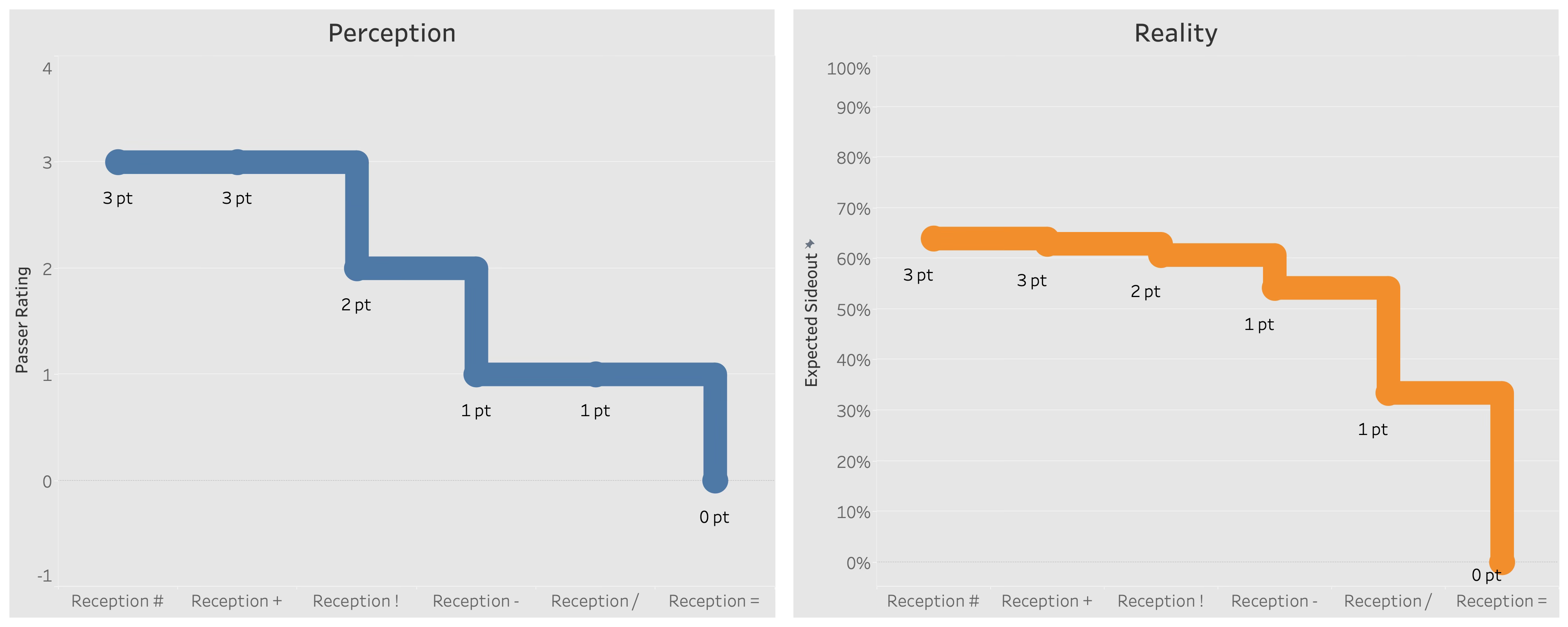
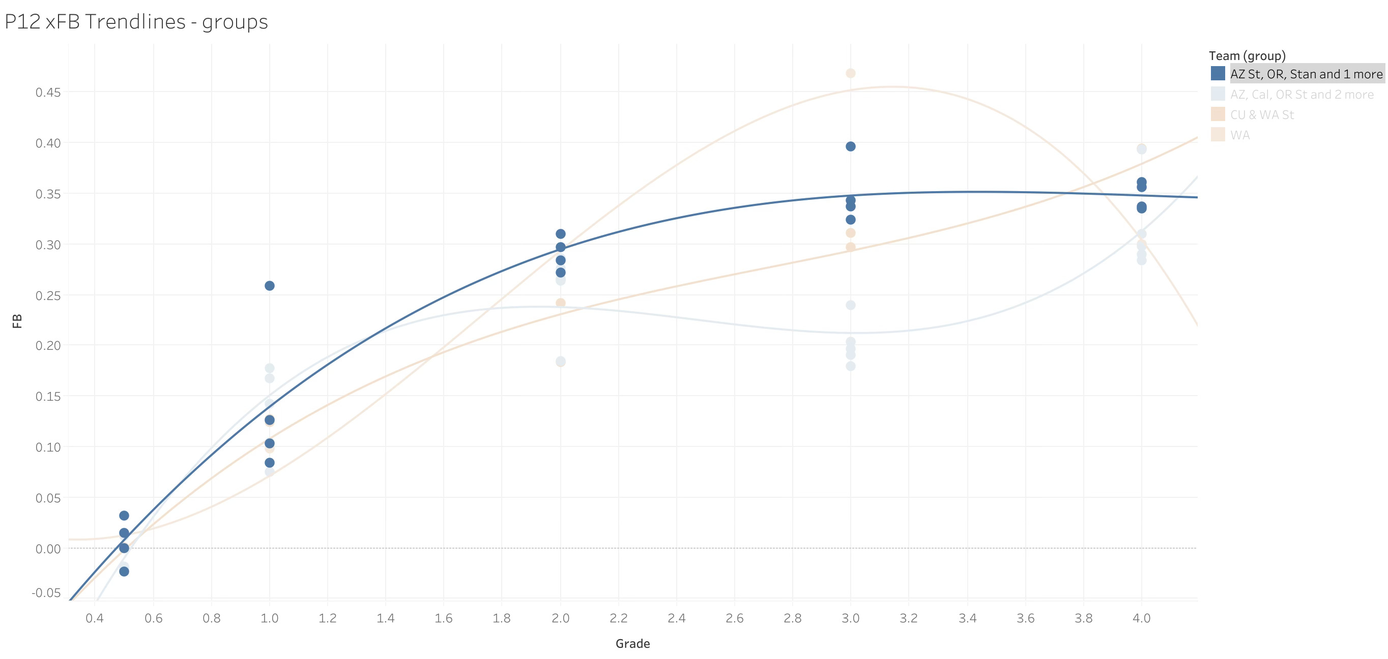
While still not directly addressing what the authors were communicating, the plots above demonstrate a danger of the quantification fixation. In the US, volleyball coaches have made reception average the most widely-used metric for measuring passing skill. It’s well understood and easy to understand but, according to this research, those factors are big parts of the problem with the metric. As the table above points out, the way people understand numbers leads to a distortion of their understanding of the concepts that underlie the numbers. Because reception averages cover a range of 4 to 0, it’s convenient for people to think that a one-unit difference between one player’s reception average and another’s corresponds to a linear increase in performances from the higher-ranked player to the lower-ranked one. The problem is the 4-0 scale doesn’t accurately differentiate between the two players’ actual abilities. But, because people are so fluent in small, whole numbers, it is assumed that the actual difference between two players is well understood.
That assumption is at the heart of quantification fixation. If you see numbers you’re familiar with, you’ll assume you are also familiar with whatever is being measured. As a result, you’ll overweight how important measures are when you feel you understand them well. Conversely, when you encounter measures that might measure the same kind of performance but use a less-familiar scale, you’ll underweight its importance. Given that athletic performance is overdetermined, it’s easy to pay more attention to the performance measures you think you know and downplay other measures of the same skill.
Quantification fixation is one particular expression of a concept called comparison fluency, which is describes how intuitively interpretable measures are compared to one another. One possible solution the authors suggest to mitigate quantification fixation is to make measures less fluent rather than more. Doing so pushes evaluators to more carefully consider the data presented before making a decision.
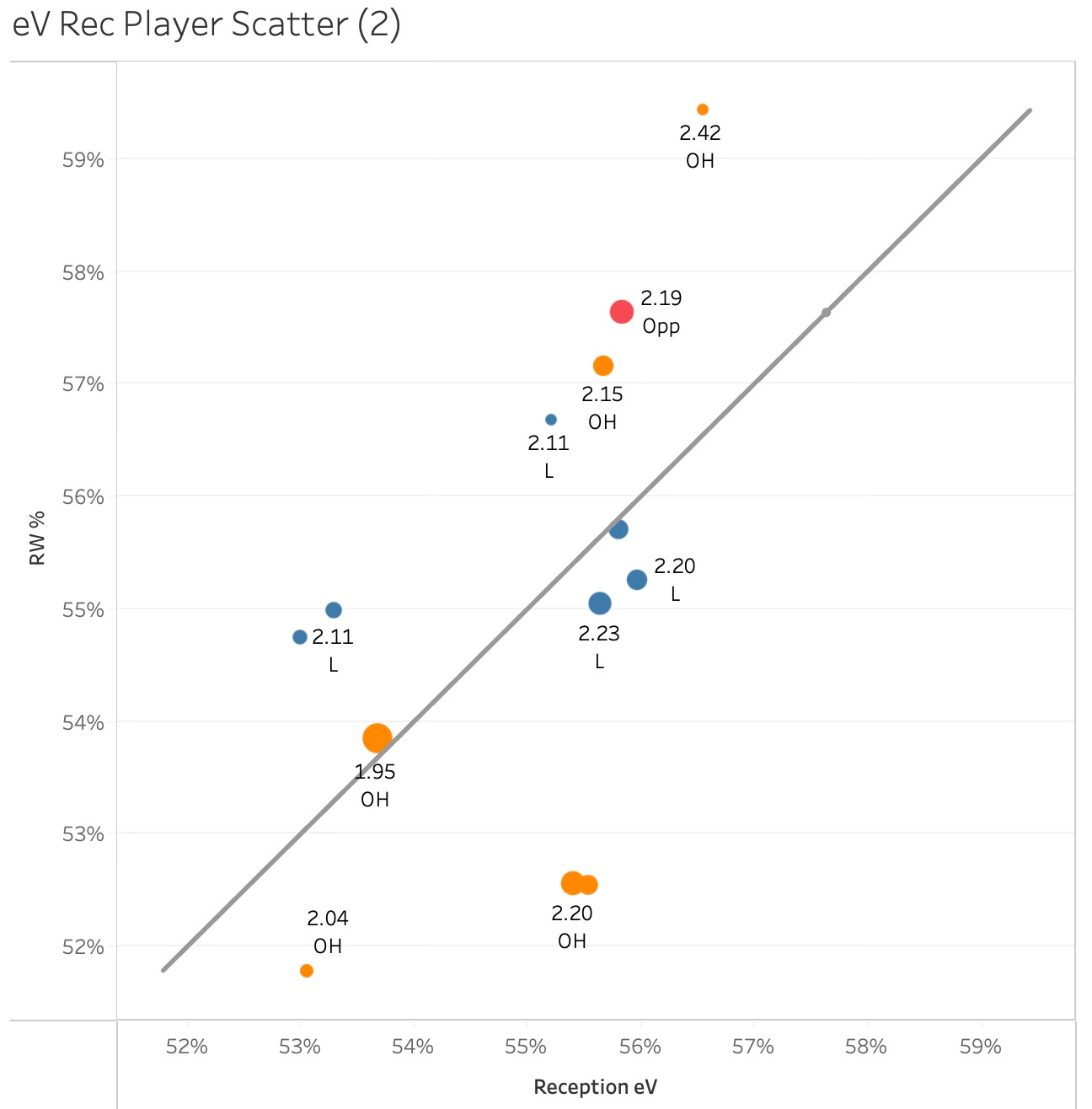
The graph above is an example of decreasing comparison fluency. While the plot includes reception averages, those values aren’t tied to either axis so the numbers do not align in any way that allows viewers to easily make decisions based on that measure. The positioning of the marks relative to the reference line is what this plot is really about. Marks above the reference line are above expectations and marks below the line are below expectations. Marks further away from the origin are “better” while those closer to the origin are “worse”, relatively speaking. This representation forces a coach to reckon with the differences between the measure they’re comfortable with (reception average) and other measures of the same skill. They can’t just take a higher reception average and assume it means “better”. This is one possible way of combating quantification fixation. But it is also possible to increase comparison fluency by providing the same performance measures in both numeric and qualitative forms.
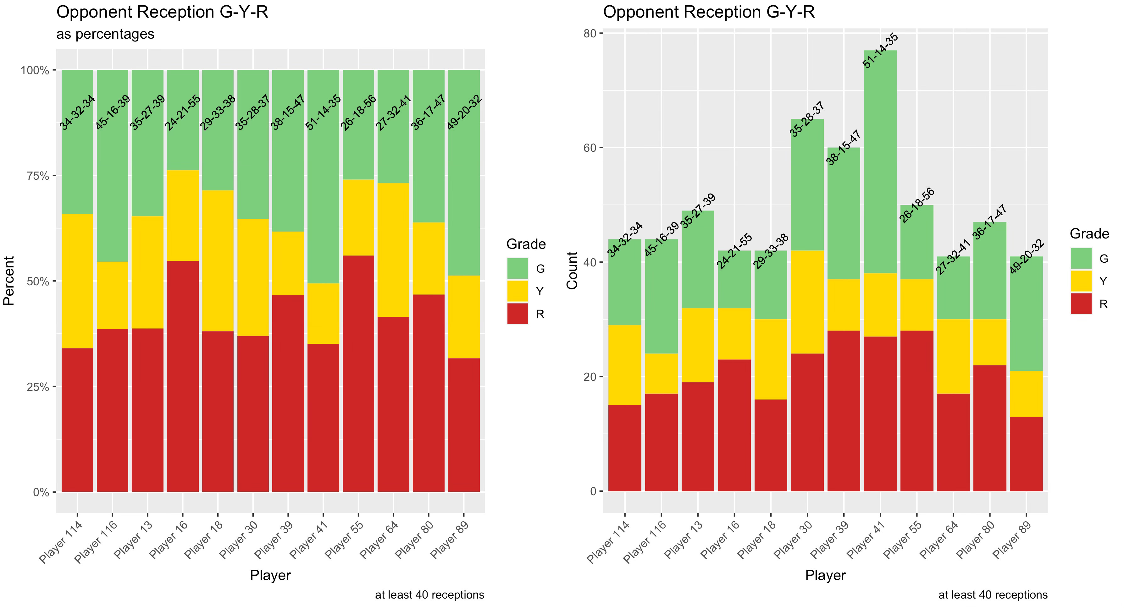
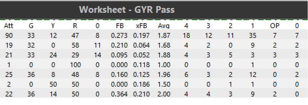
Together, the stacked bar graphs above are an example of increasing comparison fluency while using both numeric and qualitative descriptions of performance. The base measure used to describe reception performance is the same 4-0 scale mentioned above but made qualitative instead of numeric. Rather than calculating a numeric average that expresses performance in the customary way, the qualitative measure is comparatively both less fluent and more fluent at the same time. It is less fluent because it isn’t the same numeric measure coaches are used to, but it is more fluent because a green-yellow-red system of classification is still easily understood and compared. More green is good, more red is bad. To facilitate comparison, numeric descriptions of each category are given for each player. Rather than just present a graph of more straightforward averages, the plots give more depth about how each player creates their average while never showing that average.
An important note about comparison fluency is that increasing it does not necessarily make decisions easier. Increasing comparison fluency is about making data easier to interpret and, therefore, easier to compare. The key takeaway from the research is that information providers need to be aware of how they present information to decision makers. They should strive for high levels of comparison fluency while not avoiding opportunities for quantification fixation. While tables of numbers may often be the most comfortable choice for coaches, analysts can find ways to introduce new ways of looking at data in other forms if they keep in mind how they introduce those new measures and visualizations.
My thoughts were initially inspired by this Choiceology podcast episode, which led me to the academic paper referenced in the footnote below.
Chang, L. W., Kirgios, E. L., Mullainathan, S., & Milkman, K. L. (2024). Does counting change what counts? Quantification fixation biases decision-making. Proceedings of the National Academy of Sciences, 121(46), e2400215121. https://doi.org/10.1073/pnas.2400215121