
The Romo Effect and the Coming Evolution of Volleyball Storytelling - part 3
Creating Building Blocks That Change How We Watch the Game

This is an adaptation of the presentation I gave for VolleyStation at the 2025 AVCA Convention. Slides and presentation video can be found at the bottom of this post. All data is taken from NCAA tournament semifinals and finals, 2015-2025 and the 2025 NCAA tournament regional semifinals and finals.
In part 2, I started sharing the building blocks for the evolution of volleyball storytelling. In this part, I’ll finish sharing those building blocks and give a tiny peek at where this evolution could take the game.

The Building Blocks Volleyball Needs
Kill percentage
Distribution data
Reception data
Points
Team scoring data
Set-level data
Points
As mentioned previously, when elite teams play, points are earned much more often than errors are conceded. For this reason, broadcasters and fans should be exposed to earned points (kills, blocks, and aces) much more than they should be exposed to errors. There's so much more to talk about.
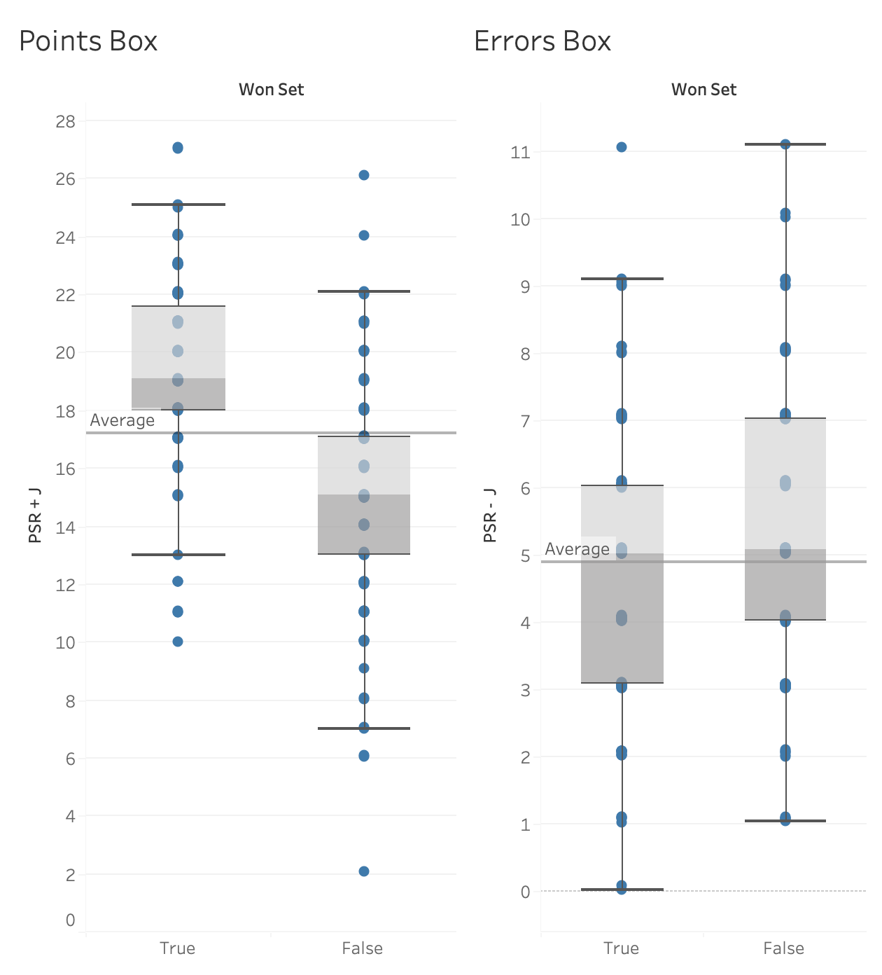
The box plots above are separated in two ways. First, they are split into earned points (pair on the left) and unforced errors (pair on the right). Then, they are split into when teams won sets (left side of each pair) and when teams lost sets (right side of each pair). What you see is that, on average, set-winning teams earn about 19 points and commit about 5 unforced errors. On average, set-losing teams earn about 15 points and commit about 5 unforced errors. The difference between winning and losing is more often in the number of points each team earns rather than in the errors they commit.
But to tell stories about points, information about points needs to be made clearly available. While this is the case internationally, it is not the case in the U.S.. NCAA box scores typically do not display points as a single number and, if they do, the way blocks are counted can make the number unreliable. If earned points and unforced errors were displayed consistently and in one place, people could easily relate those numbers to the race to 25 points as they watch a match.
Kills and Errors: an Example
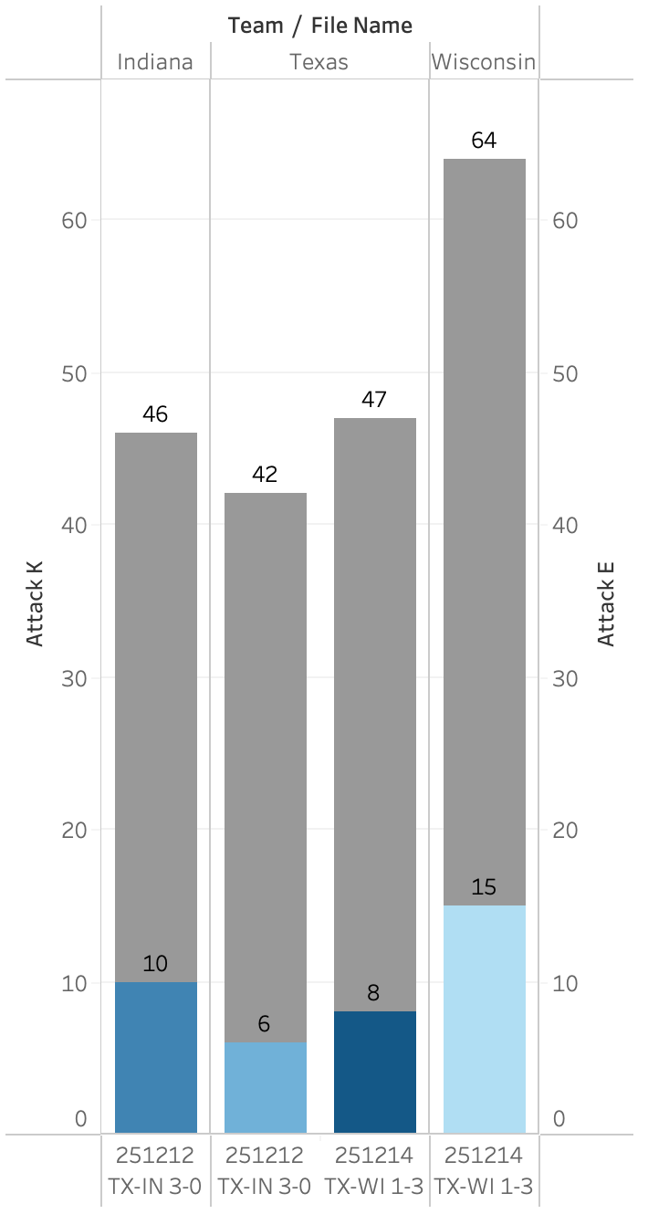
In the 2025 NCAA regional semifinals and finals, Texas first beat Indiana and then lost to Wisconsin. In the graph above, the two leftmost bars show Indiana's kills and attack errors as well as Texas'. The two rightmost bars show the same information for Texas, followed by Wisconsin. In the match against Indiana, Texas made fewer unforced attack errors than Indiana but also earned fewer points than they did. Indiana had more of each, but in equal amounts, so both teams were equal in points won and lost via attacking. This means the match was decided by other factors. In this match, Texas had 12 blocks while Indiana had 3. Two nights later, Texas committed nearly the same number of unforced errors and had slightly more kills against Wisconsin than against Indiana. While Wisconsin committed quite a few unforced attack errors, they more than made up for that by having more kills than Texas by a wide margin. Being able to see how and how much teams are earning points is a powerful part of telling stories about how and why teams win.
Team Scoring: Side Out and Point Scoring
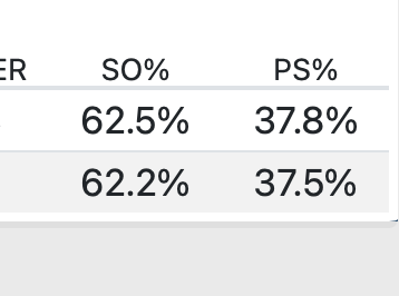
Team scoring data is another building block that helps people understand how the race to 25 progresses. This data has been made more available by NCAA teams in recent years but, because it is still not universal, it is rarely used by fans and broadcasters to explain how matches unfold. But side out percentage and point scoring percentage are simple, powerful pieces of data that can help tell stories about who's winning, who's losing, and why.
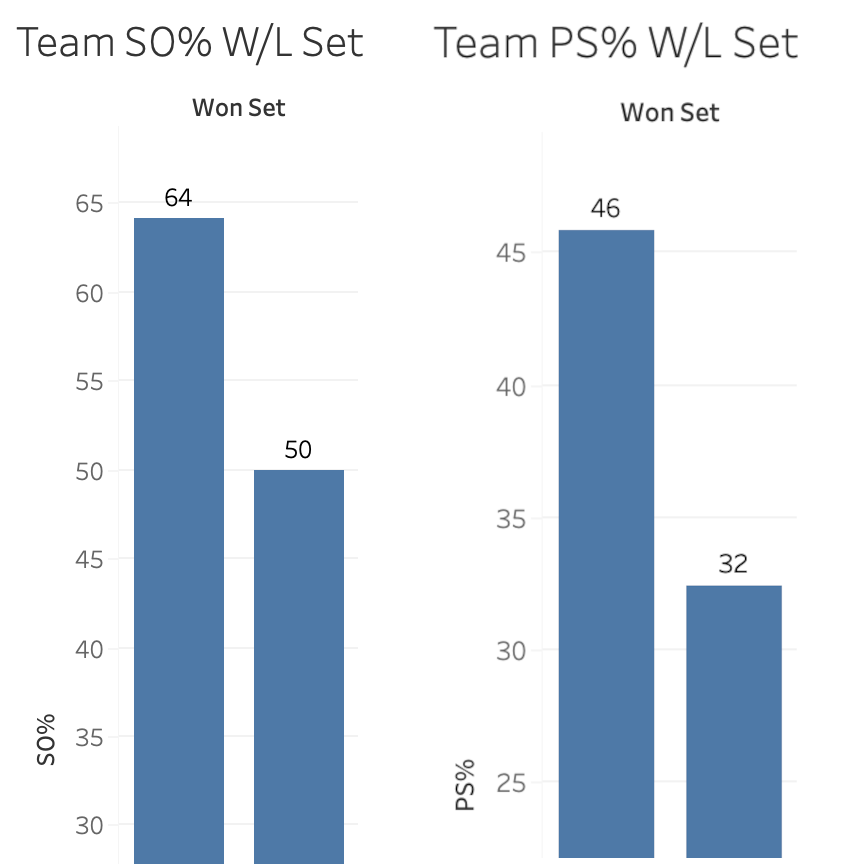
In the graphs above, the left pair show side out percentage while the right pair show point score percentage. Within each pair, the bar on the left shows the percentage when teams win sets, while the bar on the right shows the percentage when teams lose sets. The differences are clear. If a team wants to win the race to 25, they need to side out at better than 60% while point scoring at over 40%. To frame it in a slightly different way, If a team can side out at over 60% while holding their opponent to under 55% side out, they will win the race to 25.
As with the previous building blocks, team scoring data is intuitive and powerful. Does a team side out on their first or second try for an entire set? They’re probably winning. If they get stuck in serve receive at some point in a set, do they make up for it at some point with how they are serving? These are stories that become possible to follow when team scoring data is made available.
Set-level Data
The point was made earlier that winning matches in volleyball requires a team to win three races to 25 before their opponent does. Match-level data obscures how each race is progressing and makes it more difficult for people to understand how the score of the current set came to be. Only data separated by set can give that information.
This data is generally available in an NCAA box score, but only for a very limited amount of data. Typically, people can see set-level data for teams but not for individuals. While that makes some set-level storytelling possible, it's difficult to explain how individual players are contributing to their team on a set-by-set basis.
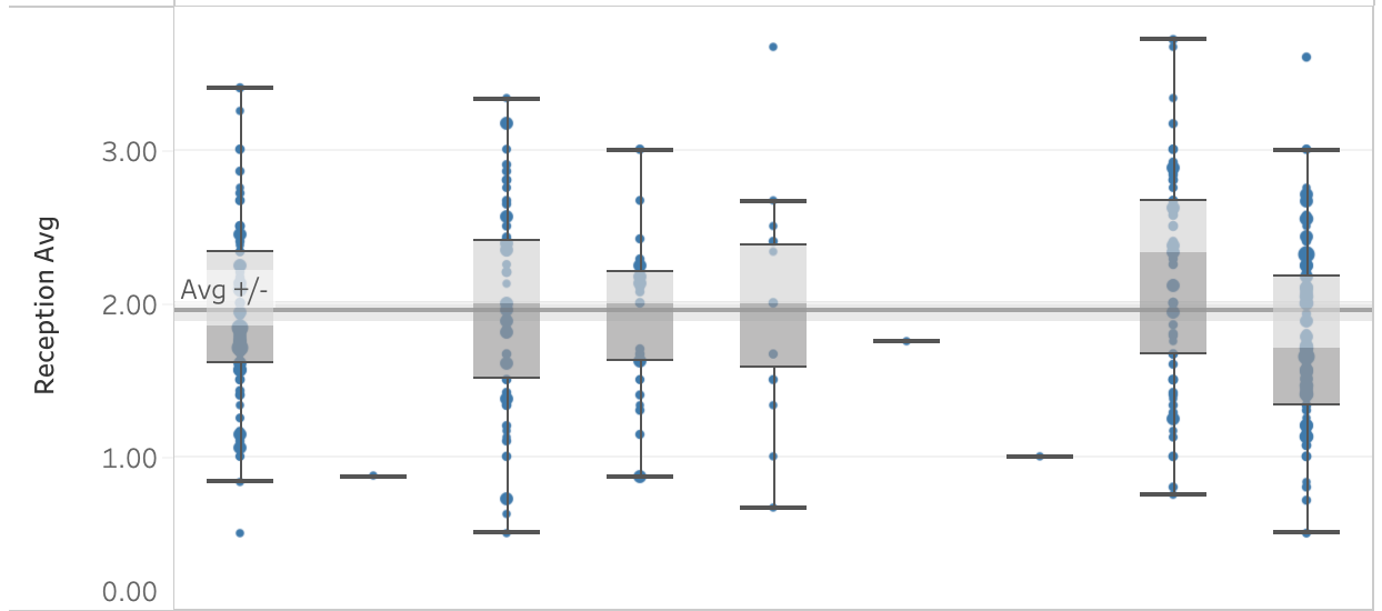
Set-level data is a powerful tool that helps explain how match-level data comes to be. The box plots above represent average players’ performances but each blue dot shows a measure of single-set performance. The sum of the blue dots yields the average, which can look very different than what happens in a single set. Having the comparison between set-level data and match-level data makes it possible to tell much more nuanced stories about performance.
Each of the building blocks listed above becomes more useful when available by set as well as for an entire match. Rather than struggling to figure out for themselves why a player or team is losing a set, despite good match averages, people can refer to how that player or team is doing in the current set and compare that information to how they did in other sets. They will be able to see how strategies such as distribution and serve targeting change on a set-by-set basis.
Looking Ahead
When stats are available that better reflect how volleyball is contested, those stats are much more easily incorporated into commentary, television graphics, and everyday volleyball talk. This helps connect more people to the game because, as Tony Romo illustrates, volleyball people can point others to what’s going to happen and where it’s going to happen. Broadcasters can set up more interesting pre-match discussions about how teams compare and what to expect when they compete.
When volleyball people have access to building blocks that connect better to the game they’re watching and talking about, they are able to make richer comparisons to other sports. A volleyball setter isn’t just like a football quarterback because they both take the ball and give it to other people. A setter is like a quarterback because they make reads of situations and make offensive adjustments to exploit what they see. A setter can “check down” to a different offensive option as their team’s reception forces them to move off the net. When the number of kills two teams earn don’t differentiate them from one another (like Texas against Indiana above), earning points in other areas of the game help explain the score difference. It’s like when football people talk about teams “relying on special teams” to win a game.
If we start using the building blocks described here, we create the foundation for the next evolution. These are relatively small steps, things that can be done without too much change to systems already in place. Think of how much better broadcasts will be when everyone has access to rotation-level data, heat maps, and advanced analytics. But we can’t get to the next evolution without starting this evolution first.

To view the video of the presentation as well as the slides, click this link:
